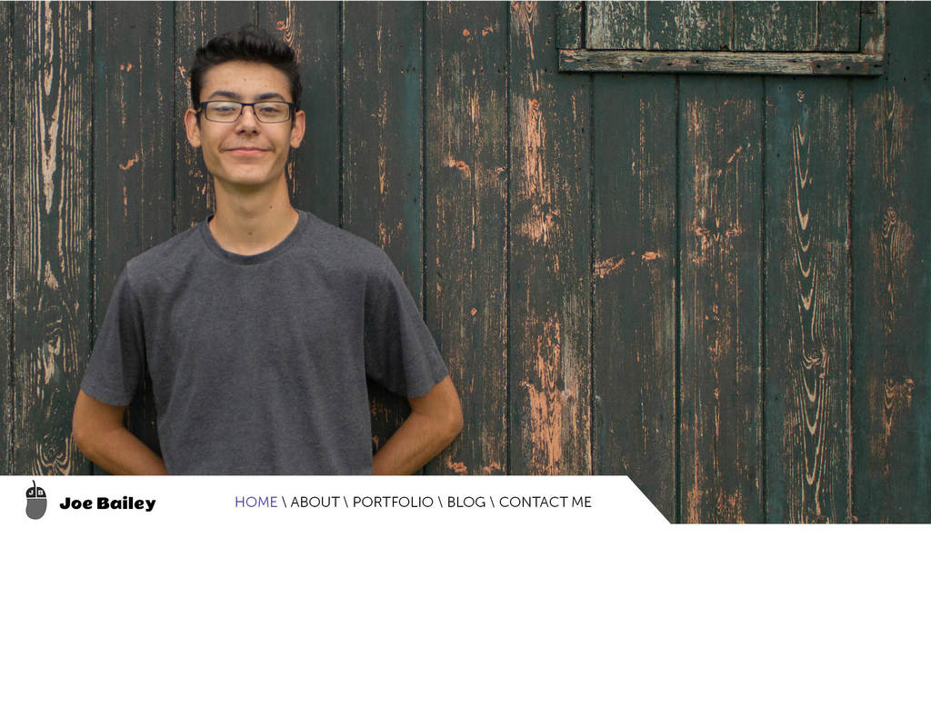
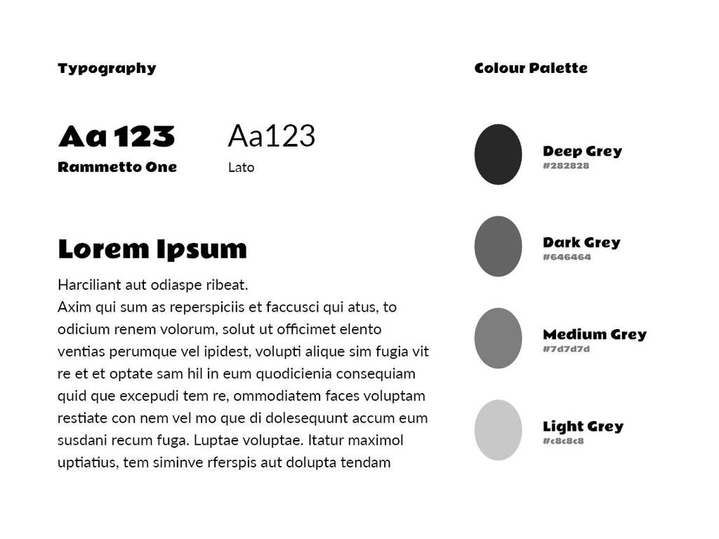
I’d been meaning to update my portfolio site for quite a while as I wasn’t really happy with the design. The long Christmas break gave me a chance to do just that. I was inspired by this template. In my lectures, we’d been learning about Figma and UX design. I wanted to use this redesign as an opportunity to learn more. I also learnt a bit of bootstrap and flexbox at the same time. I’m really happy with my site and it showcases all of my skills. You can see it here.
After creating my Web Design portfolio site and transferring my hosting package I was in the mood to do some web design. I’d been meaning to add a portfolio to my photography site for a long while.
Whilst making the photography portfolio I created some cool code to create a gallery of images which you can read about here.
I used a card style to design the portfolio and includes galleries of the best of my photos grouped into categories. It also includes, events, projects, and portraits, something that has never been seen on my site before.
I then implemented the card style for the blog posts on my homepage.
After creating the great bit of code I used it to alter the galleries on my memories page, which makes it load a bit quicker, and includes WEBP support. As I was feeling quite clever, I added a search function and the option to filter the memories by year.
I created a website for my girlfriend as she does photography too. I’m really impressed with the site, even though it is made with WordPress. Hopefully, her future employers and universities will like it too. You can view the site here.
I need to make a No Thumbnails Gallery WordPress plugin as at the moment I am using CSS to hide all the images but the first one to create the galleries you see. This really slows down the website.
–Updated 5th October 2019–
I had wanted to develop a custom theme for Chelsea’s website for a long while. The theme I was using was bloated, slowed the site down, and didn’t fit her style of photography.
I designed a template in Figma, making a style guide first, noting down the fonts, Satisfy, Montserrat, and Roboto, and the colours, Pink, and some shades fo grey. Doing a mockup of the site proved really beneficial because I made many different versions and could show them to my colleagues easily, which would have been a nightmare if I had just started developing. I even went with a mobile-first approach.
I knew that the portfolio had to be the most prominent feature on the website as that was the biggest shortfall of the previous theme. I used some JavaScript to only change the images and text on the homepage so that portfolios are all hosted on the same page. They are also shareable as they use query strings. On mobile, only 6 portfolio images can be seen but the lightbox allows you to view all 20 images.
I made a few changes to the design when I was making the website such as making the background a light shade of pink. This helped differentiate the elements on the page.
I also designed a new logo which is a lot more intricate than the initial rudimentary one.
I saw another ad on Facebook asking for a Web Developer and I met Peter Virgo, who is starting up his own political party; Integrity Politics. We decided WordPress was best suited for a website of this type. To create the site I customised the Donovan theme, which gave me another opportunity to learn some PHP. I’m going to maintain the website by adding events and news every so often.
In my Web Design and Development course, we touched on using web components and live style guides. This is the practice of having a set of components and styles that can be reused across your website. The advantage is that when something gets updated it rolls out across the whole site at the same time. I’m going to be writing a 2,000-word essay on Web Components in January 2019.
Redesigning my Photography Website
I had been toying with the idea of redesigning my site for a while, due to the changes to Flickr accounts. I thought that creating the header and footer and linking to them using PHP across the whole of my website would be a good start. Whilst doing this I finally managed to include a link to my blog on my homepage by using SimplePie and PHP.
I also created my own Instagram widget using Instafeed.js rather than using the SnapWidget plugin like I had been doing. The advantage of using Instafeed is that it links to Instagram directly rather than to a third-party website. I had looked into this before, but couldn’t figure out how to make it work.
During updating the website I combined the media queries into one stylesheet for each page, rather than separate ones. I also included a main CSS file which styles headings, body text, buttons, and the header and footer on all pages, which makes updating things a lot easier. I’m annoyed I didn’t think of it sooner.
I’m trying to tailor the website more towards getting a job, rather than a story of my work, so I’ve renamed the gallery page to memories to tie in with my tagline.
In the future, I’m going to combine the portfolio and projects pages to be a more concise view of my best photos to show off to potential employers.
The About page has been renamed to My Story because I feel it is about the story of me being a photographer, rather than about me right now, and what services I offer.
The mobile version of the site has also had a major redesign using hamburger navigation which should be a bit easier to click on.
Images will now be served in both WebP (Google’s new file format for images) and JPEG to speed up load times on modern browsers.
The site is now served from a CDN. The only downside is that the site has to be served from the www. version.

You might notice that my website uses Flickr to display most of the images. This is done by using an iframe of the Flickr slideshow.
The reason I chose to use Flickr to display my images is that I didn’t have much experience coding at the time (I’m still not a code genius). It was an easy way to display galleries of images in a lightbox. I used the handy Featherlight library for that.
Next year Flickr is changing the number of photos free accounts (that’s me) can have on their site from 1TB of free storage to a mere 1,000 photos. I have taken a lot of photos, and the 1,000 limit just isn’t going to cut it. It’s probably about time I hosted my images anyway.
I’m looking at using PHP to get all images in a directory, and then display that in a slideshow using JavaScript which in turn will be displayed in the Featherlight lightbox.
Updated 16th December 2018
I have now managed to update all the galleries on my website. Featherlight has a slideshow extension which I have used. I used PHP’s Glob feature to list all the photos in a directory, which was helpful as I could put each gallery in a folder and the code would make a gallery out of it.
My first project at university was to write a report on how I designed a set of logos to brand myself as a web developer. We had to include research, feedback and final designs. I got a C1 on this report as I found it quite hard being the first one I’ve done at university. You can see the logo below: