Over the last couple of years, me and my dad have been into buying and selling records on eBay. We buy job lots and go to car boots and charity shops to see if we can find any bargains which we can then resell.
As previously mentioned, we used eBay to do this, however, as we began to buy, and subsequently sell, more and more stock we found that eBay was quite restrictive. We looked into using other platforms, such as Discogs, but eventually decided upon creating our own website.
This proved an exciting challenge. Studying Web Development at university I am always eager to practise my skills. I’d dabbled in making e-commerce sites before but wasn’t quite technically literate enough to make anything of them. The making of Don’s Discs gave me a chance to start from scratch and learn on the go at a pace I set.
Firstly, we sat down and made bulleted notes of what we wanted the site to achieve and what purpose it would serve. This then let me tailor the design to brief.
Once I had finished my first year of university I began to make a design of the site in Figma. Me and Dad then went over the designs to make necessary changes before beginning production on the site. I used images from Unsplash to template the site. I researched a lot of other record store websites to get an idea of the current market and design trends before making my own version fit for the Dons Discs brand.
Once the design was completed, I set up the domain with my hosting provider, iPage, and configured Cloudflare. I then installed a fresh copy of WordPress. I wanted to create a theme from scratch as I’d only done that once before, with my photography website’s blog. I used the Storefront theme as a starting point to get an idea of what files I would need. It took about a month of work to get the site looking like the Figma design.
We did make a couple of design changes along the way such as changing the blue in the header for white and adding a black bottom border to the header to replicate the business card and make it stand out more.
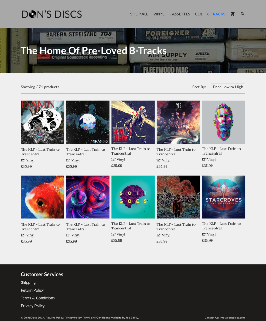
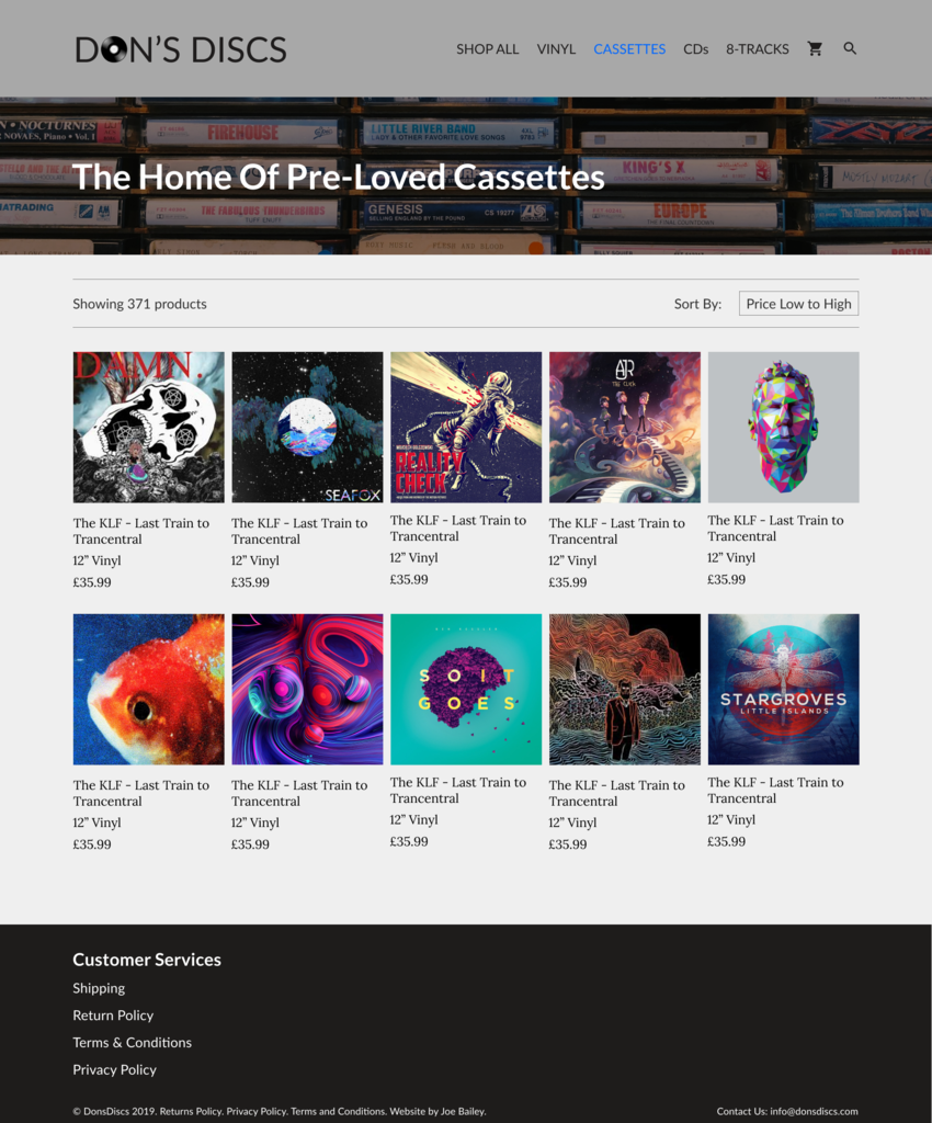
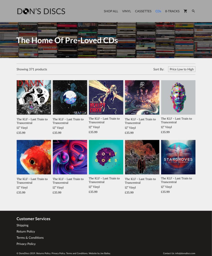
We took our own photos for the headers of each page to make it really feel like our own work.
I added a JavaScript animation on the home page showing a typing and deleting effect. I found this on CodePen and adapted it to my needs.
We spent a while figuring out how to control the stock of our products, as the WooCommerce built-in stock control is aimed at items that have multiple quantities whereas the type of things we were selling we only had one of.
One thing that really tested my ability was customizing the sort by filters. We only really needed to sort the products by price, so I had to hook into the shortcode and remove the other options from all pages, not just the homepage. This took a lot of Googling.
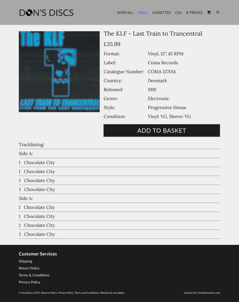
We then started to figure out how to import products from Discogs to the website. Discogs exported a CSV file which we then mapped to Woocommerce’s product importer. The attributes were very difficult to get right but the desired effect was achieved in the end. This also helps on the front end for customers to filter the products as eventually there will be thousands of product listings on the website.
The site is now live and slowly being populated with products.


