Disabled Peoples Voice

I got in touch with this client through Solent Creatives. They needed a website and shop to showcase their charitable work. They sell cards to raise money for charity and the site has a lot of info about them, and their events.

They had already hired a graphic designer and he gave me a PSD of each page. I then developed a custom theme for the site making sure it was pixel perfect.

I then conducted thorough cross-browser testing before showing the website to the client who was very happy with it.

Re-doing my portfolio

I built my web design portfolio site over the Christmas of 2018 and decided it needed a bit of a refresh during the summer.

I got in touch with the @_tashhockey, the person behind Honest Feedback, to give my website a bit of a review. She made some really good points and brought to light the fact that I was trying to make my website too much. It was my personal space to show off my work, it was for clients, and for future employers.

It took me a few months, but I decided I was going to focus on making my website a portfolio to show future employers. Something else is in the works to show clients.

I took out a lot of the content which had the added benefit of making the page load a lot quicker, and took a lot less time to scroll through. It now features my best websites and that’s it.

On mobile I made the portfolios scroll horizontally which means that the user doesn’t have to scroll past loads and loads of content.

I’m really happy with the design of the website so I only made some minor tweaks to colours to make things more legible. Redoing my portfolio provided me with a chance to brush up on my JavaScript and jQuery skills too.

Animated mobile menu

In quite a few of my projects I’ve needed a quick and easy way of making a menu which scales onto mobile. I like the style that android apps have; the animated drawer, so I have replicated this.

The menu is swipe aware using Hammer.js which means if you swipe right on mobile then the navigational drawer will slide out and if you slide left, then it will disappear.

I created a Gist on GitHub to allow me to quickly and easily copy the code into my projects.

No scroll whilst lightbox is open – Joe Bailey Photography

I read the following article by CSS Tricks https://css-tricks.com/prevent-page-scrolling-when-a-modal-is-open/ and decided that my website shouldn’t scroll whilst the lightbox is shown, i.e. on the Blog and the Memories pages when an image is clicked.

I use the Featherlight plugin on my Blog and the equivalent for the Memories page.

I added the following CSS to my Blog, which now means that the page will not scroll whilst the lightbox is open, but sticky elements like the navbar and the sidebar will stay in place. Similar code was added across the rest of the site.

html {
	position: relative!important;
	overflow-x: hidden;
}
html.with-featherlight {
	overflow-y: hidden;
	width: 100%;
}
html.with-featherlight body {
	overflow-y: scroll;
}
html.with-featherlight nav.featherlight-fix {
	position: fixed;
	margin-top: 0;
	left: 0;
}
html.with-featherlight #sidebar.featherlight-fix ul:first-child {
	position: fixed;
}
html.with-featherlight .cc-window.cc-banner.cc-type-info.cc-theme-edgeless.cc-bottom.cc-color-override--591744288 {
	width: calc(100% - 17px);
}
@media (max-width: 830px) {
	html.with-featherlight nav {
		margin-top: 0px;
	}
	.featherlight-previous, .featherlight-next {
		display: none!important;
	}
	html.with-featherlight #sidebar ul:first-child {
		position: -webkit-sticky;
		position: sticky;
	}
	html.with-featherlight .wrap {
		margin-top: 50px;
	}
}
@media (max-width: 830px) {
	html.with-featherlight nav {
		margin-top: 0px;
	}
}
@media (max-width: 1100px) and (min-width: 830px) {
	html.with-featherlight header.featherlight-fix {
		margin-bottom: 68px;
	}
	html.with-featherlight nav {
		margin-top: 0;
		margin-bottom: -7px;
	}
}

Whilst experimenting with this I found that the built-in WordPress galleries did not work on Safari 10.1. I then filed a bug report which you can follow here: https://core.trac.wordpress.org/ticket/47744

Island RIBs

I was put in touch with Island RIBs through Solent Creatives. They needed a website redesign as they were refreshing the content on the site. They had already written out what parts of the website they wanted changing, and I worked with them to accomplish this and implement the new content.

This was a good experience for me. As it was hourly work, I had to keep tabs of how long I had spent on one task. It was also good to stick to the brief without deviating from it, as many of the websites I work on have a wide scope to the project.

I used the WP Staging Pro plugin to work on the website with the client so that they could preview all the changes I was making and we could push the site live in one go.

The website uses Generate Press as a theme, but whilst updating the content on the site I migrated their pages over to using the standard Gutenberg Block Editor.

Dark Mode – Joe Bailey Photography

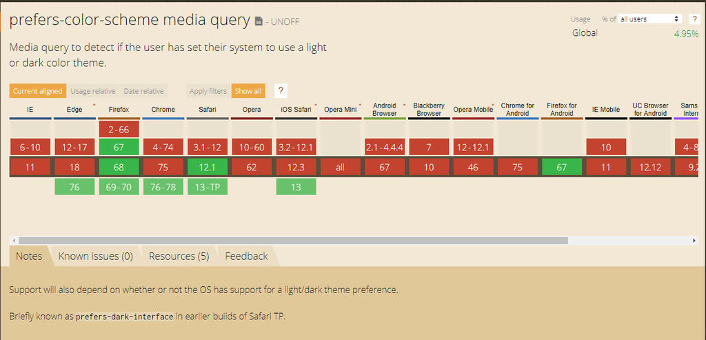
I read the following article: https://www.howtogeek.com/434592/what%E2%80%99s-new-in-chrome-76-arriving-july-30th/ and was excited by “Automatic Dark Mode is Coming to Websites”. I decided to give it a shot. I read up on the Media Queries Level 5 spec and added the “prefers-color-scheme” media query to my CSS.

I downloaded a copy of Chrome Canary to test the website, as this feature isn’t quite out in the current release of Chrome yet, however, the media query is supported in Firefox, so if you have Firefox installed and dark mode turned on, go check my website out.

Here’s a sample of the code I used:

@media screen and (prefers-color-scheme: dark) {
	body {
		background-color: #202124;
		color: white;
	}
}

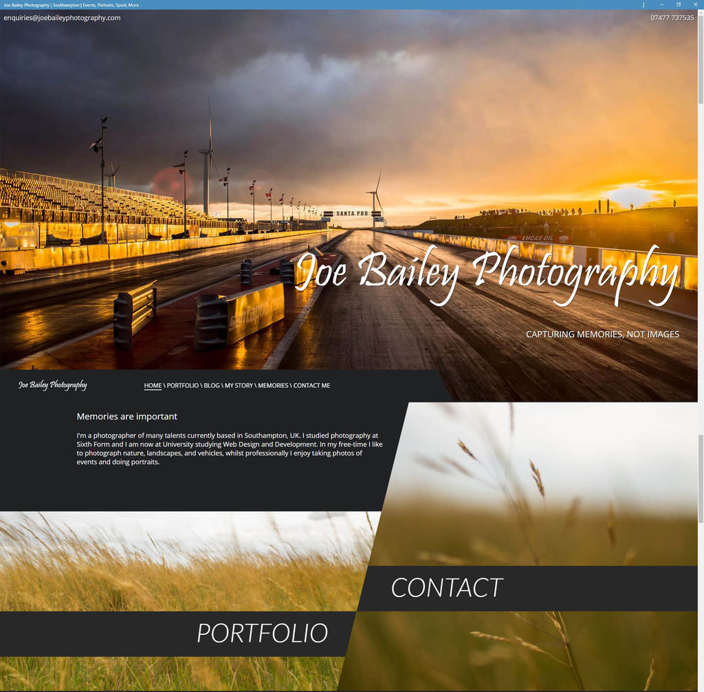
By using Chrome Canary I also found out that I could install my website to windows, and not just my phone, which I found really cool. It comes up in start, the taskbar, the desktop, and has its own icon. I was astonished. The internet is really moving in a cool direction and I’m glad to be pioneering these new technologies with my photography website.

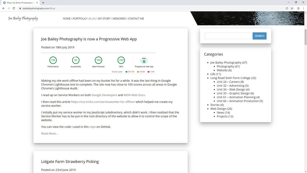
Joe Bailey Photography is now a Progressive Web App

Making my site work offline had been on my bucket list for a while. It was the last thing in Google Chrome’s Lighthouse test to complete. The site now has close to 100 scores across all areas in Google Chrome’s Lighthouse Audit.

I read up on Service Workers on both Google Developers and MDN Web Docs.

I then read this article https://css-tricks.com/serviceworker-for-offline/ which helped me create my service worker.

I initially put my service worker in my JavaScript subdirectory, which didn’t work. I then realized that the Service Worker has to be put in the root directory of the website to allow it to control the scope of the website.

You can view the code I used in this repo on GitHub.