a) purpose
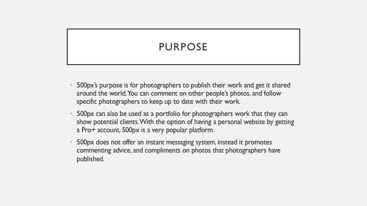
For photography students to share ideas, and work in a safe, secure environment. They can follow their favourite photographers. Write blogs and use this as work experience on their CVs. They can find people to work with to practice their skills and to learn from.
b) content
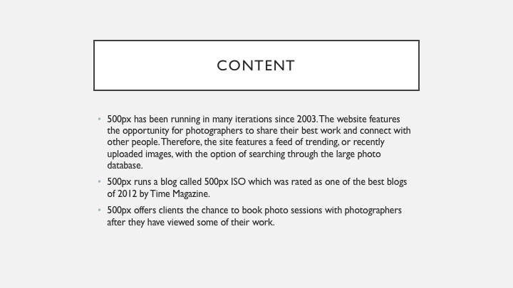
There will be a navigation bar at the top of the page. Popular photographers will be featured on the home page, encouraging people to like and follow them. Users will have a profile page with a showcase of 25 photos, and all of their work, including recent blog posts. There will be an explore page where users can search for photographers or content. Adverts will be displayed among search results and featured photographers. The adverts will be non-obtrusive.
c) target user/membership
Target users are photography students aged between 16 and 25. They will be interested in the world around them, and in doing photography later in life. There will be a paid option which removes adverts and offers users advanced statistics about their blog and profile as well as a portfolio website. Members will pay £5 per month to get these features.
d) production plan / timescales

f) possible revenue streams (how it might make money)
The website will feature non-obtrusive advertising throughout which will bring in the majority of revenue for the company. There will be a paid membership option which will also bring in revenue for the company.
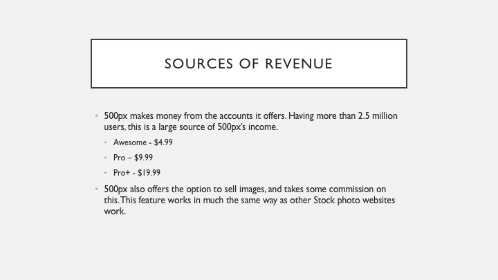
6 Months after the initial launch of the website we hope to have 5000 people signed up. Approximately 5% of these will pay to be members. 250 Members * £5 per month = £1250 per month. This is already a profit of £990.01 per month. Adverts running on the site will give us a revenue of approximately £100 per month depending on website traffic. Overall profit will be £1090.01 per month.
g) budget
All the design work has been done for free, by me. The website will then need to be coded into a working example. Presuming one web-developer will work on this website for 30 hours per week for 1 week to create the website and get it to a state to be published if he works for £25 per hour this initial process will cost £750.
The website will then have an additional cost per month for server hire, website domain name, professional email, and website maintenance provided by our full-stack web-developer. Server and Email and Domain package will cost £9.99 per month. Our developer will need to work on the website for 10 hours each month to implement security fixes and updates, this will cost £250. Therefore, the website will cost £259.99 per month to maintain.
h) consider legal/ethical issues
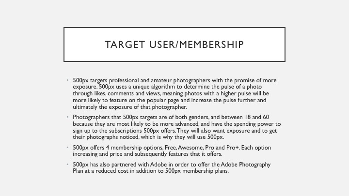
Photography is often used to express the human body as an art-form which leads to nude photography, as this website is for students, potentially underage, no photography of this kind will be allowed on the site. Users under 13 will require their parents’ permission to sign up to the site, but there will be no age limit to join.
i) Privacy/security measures
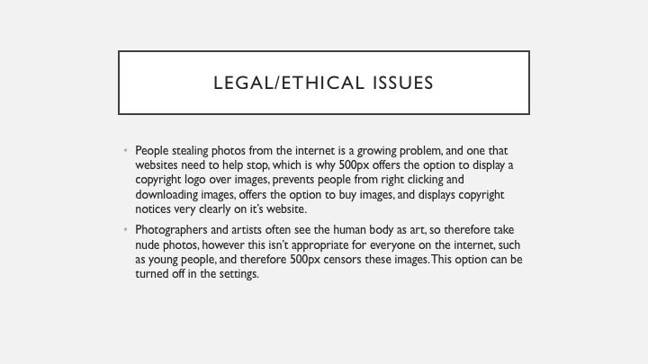
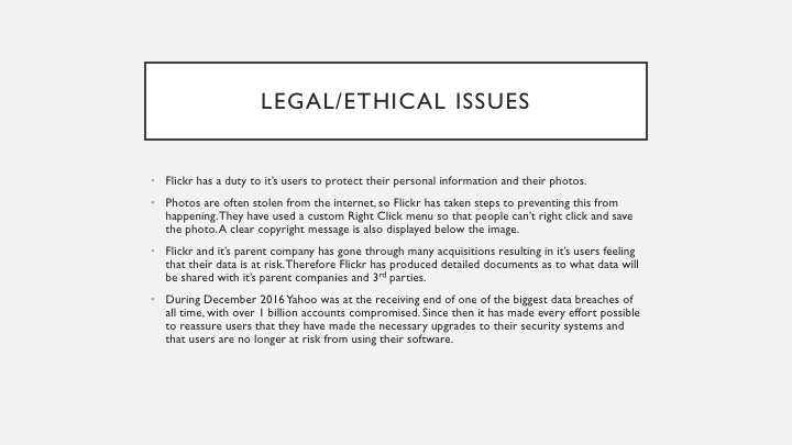
The website will use HTTPS to encrypt the connection between the server and the user’s computer. The database containing members passwords will use 256-bit encryption. The website will use a CDN to serve images, making the website load faster. There will be a custom right click plugin installed on the website to prevent people from saving users images. Only low-resolution images will be shown on Google, preventing people from stealing our members’ images. Copyright logos will also be shown on the images.
j) site map
k) Detailed information as to why that target audience will find it useful and easy to navigate around the website.
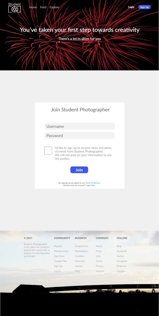
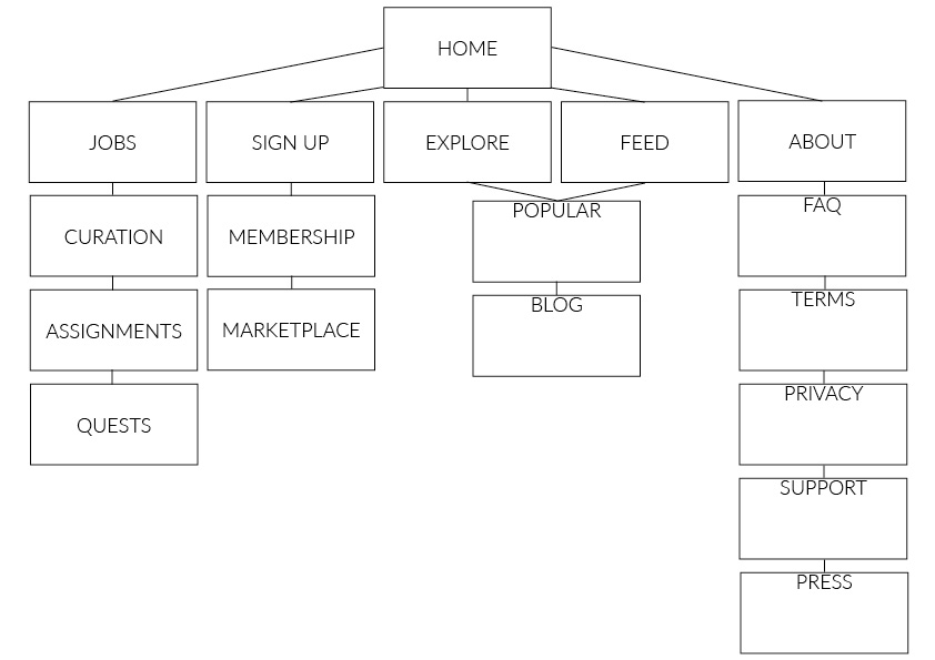
The target audience will find this website useful as it will help them develop their photographic skills. Only the most important pages have links at the top of the page, whilst the more in-depth terms and conditions pages are at the bottom of the page out of the way in order to showcase users’ photos at the top of the page.
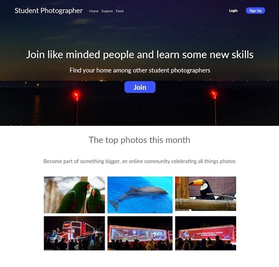
The homepage has many links to sign up to the website, encouraging users to do just that so that they can see all the features. Text hierarchy draws users to read the catch phrase, then to join the website. If people continue scrolling down they see high standard images from users on the site, giving them an example of what the site is used for. The footer contains links to more in-depth pages containing information for the press, about the company, copyright information, jobs, etc. These page links are in a list with a header summarizing what the links below are about. This helps users to navigate to the page that they want and find out the correct information.
A user’s page is very simple, with the nav bar at the top of the page, allowing users to search the site, upload photos, and navigate through the site. There is a cover image chosen by the photographer which will be their best photo, then there is their logo which is a circle, situated in the centre of the page. There is a brief biography below the user’s name, with links to different sections within their account. Images are presented clearly, cleanly and take up most of the page, as this is what the website is for, and this is what the target audience will want to see. The same footer is used for ease of use so that the website has a coherent corresponding design.
The website is very simple to use and features a design that does not change on different pages, this makes it easy to use for the target audience as they want to get information as quickly as possible so don’t want to click through lots of different web pages in order to look at a feed of photos. Photos are very large on the website as this is a photography website which means it will attract the target audience and they will be able to see examples of work that they could do or photographers they could work with.
a) purpose
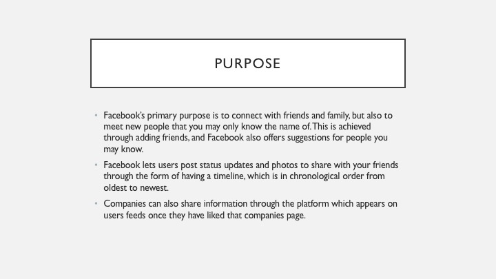
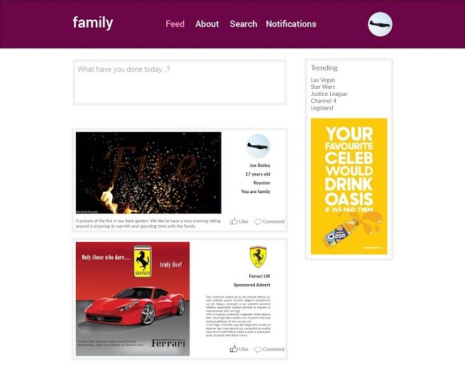
A family-based social networking platform similar to Facebook but without memes and pages. Members will be able to post status updates, along with photos and videos to share with their family and friends. There won’t be alike or share system, but people will be able to comment on posts, with a very in-depth sensor system, allowing users much younger than 13 to join the site, unlike Facebook. Images will be stored at high quality as a way of backing up photos, there will be an option to download everything ever uploaded to the site if users lose their photos.
b) format/style
There will be card based posts on a user’s feed that people can swipe to get rid of, much like Inbox by Google. They will swipe them after they have seen them to remove them from the newsfeed. Users will have profile pages displaying all of their posts, and a little section about them to help other users identify who they are.
c) target user/membership
Target users are 20-40-year-old parents of both genders who want to share their photos with extended family members and friends. It will be free to join the site, with options to pay for upgraded storage to store more photos.
d) mock ups
a) purpose
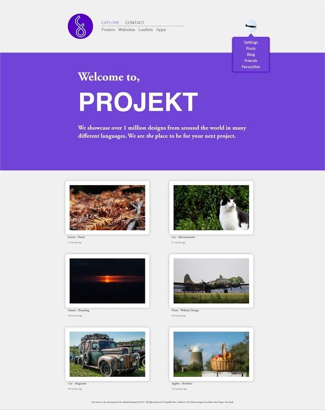
A website for designers to post their ideas and designs and get feedback from other likeminded people. There will also be employers on the website which can find designers suited to their workplace which they can get in contact with to hire.
b) format/style
The website will be very nicely designed using a minimal style as it is aimed at designers so will have to look nice. There will be no adverts on the site. The homepage will be an about section, explaining how the site works. There will then be a page featuring the latest designs from people all over the world. There won’t be a search function, but people will be able to sort the feed into categories such as posters and websites.
c) target user/membership
Target users are designers aged 20-30 with a high spending power as you have to subscribe to this website $4.99 a month. This ensures only the best designers are putting their best work on the site. The website will be global, with a headquarters in America.
d) mock ups
a) purpose
For photography students to share ideas, and work in a safe, secure environment. They can follow their favourite photographers. Write blogs and use this as work experience on their CVs. They can find people to work with to practice their skills and to learn from.
b) format/style
There will be a navigation bar at the top of the page. Popular photographers will be featured on the home page, encouraging people to like and follow them. Users will have a profile page with a showcase of 25 photos, and all of their work, including recent blog posts. There will be an explore page where users can search for photographers or content. Adverts will be displayed among search results and featured photographers. The adverts will be non-obtrusive.
c) target user/membership
Target users are photography students aged between 16 and 25. They will be interested in the world around them, and in doing photography later in life. There will be a paid option which removes adverts and offers users advanced statistics about their blog and profile as well as a portfolio website.
d) mock ups
Primary Research
Questions Asked:
1) How much time do you spend on Social Media a day?
2) Is your time well spent on Social Media?
3) How many Social Media apps/websites do you use?
4) Have you ever had any bad experiences on Social Media before?
Answers:
Question 1:
|
Less than 1 hour a day
|
1
|
|
1-2 hours
| |
|
3-4 hours
|
2
|
|
5-6 hours
|
2
|
|
More than 6 hours
|
Question 2:
| Well spent | 1 |
| Not well spent | 4 |
Question 3:
| 1 app used |
|
| 2-3 apps used | 4 |
| 4-5 apps used | 1 |
| More than 5 apps used |
Question 4:
| Positive experience of social media | 3 |
| Not positive experience of social media | 2 |
Secondary Research
This is an extract from a Nottingham Trent University Study into social media addiction.
“I’m an addict. I just get lost in Facebook” replies a young mother when asked why she does not see herself able to help her daughter with her homework. Instead of supporting her child, she spends her time chatting and browsing the social networking site. This case, while extreme, is suggestive of a potential new mental health problem that emerges as Internet social networks proliferate. Newspaper stories have also reported similar cases, suggesting that the popular press was early to discern the potentially addictive qualities of social networking sites. Such media coverage has alleged that women are at greater risk than men for developing addictions to SNSs.”
This statement is saying that people can become addicted to Social Media, and while it isn’t quite proven, it is a very real thing, and it can affect people negatively. Whilst conducting my primary research, I had conversations with people who said that it was part of their daily routine and that they could not go a day without it in case they missed out on any important information.
The following is an extract from a Study on whether Facebook has a direct link to emotional well-being.
“Critically, we found no evidence to support two plausible alternative interpretations of these results. First, interacting with other people “directly” did not predict declines in well-being. In fact, direct social network interactions led people to feel better over time. This suggests that Facebook use may constitute a unique form of social network interaction that predicts impoverished well-being. Second, multiple types of evidence indicated that it was not the case that Facebook use led to declines in well-being because people are more likely to use Facebook when they feel bad—neither affect nor worry predicted Facebook use and Facebook use continued to predict significant declines in well-being when controlling for loneliness (which did predict increases in Facebook use and reductions in emotional well-being).”
Forbes summarised this study stating that “The study found that Facebook use was linked to both less moment-to-moment happiness and less life satisfaction—the more people used Facebook in a day, the more these two variables dropped off. The authors suggest this may have to do with the fact that Facebook conjures up a perception of social isolation, in a way that other solitary activities don’t.”
The following study found that more friends on social media don’t necessarily mean you have a better social life—there seems to be a cap on the number of friends a person’s brain can handle, and it takes actual social interaction (not virtual) to keep up these friendships. So feeling like you’re being social by being on Facebook doesn’t work. Since loneliness is linked to myriad health and mental health problems (including early death), getting real social support is important. Virtual friend time doesn’t have the therapeutic effect as time with real friends.
“There is some evidence to suggest that one of the motivations for using social media among teenagers is to extend their range of social contacts. Indeed, it has specifically been claimed that those who are more socially competent use social media to expand their network of friendships, thereby increasing their social capital. However, young children, and to some extent teenagers, are relatively poor at judging relationship quality: very young children, for example, commonly mistake a desire to form friendships on their part with the assumption that such friendships are reciprocated. Adults tend to be more attuned to the nuances in different types of relationship and are less prone to signing up to ‘friending’ requests without considering the nature of the relationship involved. They may thus provide a better test of the hypothesis than the teenagers who have been the focus of most social media research.”

