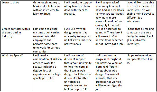
Skills and Resources Gaps (As outlined in P3):
By using this plan, I will have a good opportunity to learn more web design languages, as outlined as a weakness in P2 and P3. I will do this after I have finished Long Road, during my summer holidays. I will use my time at university to build bigger and more complex websites.
I will learn to drive after my time at university which will help me get to different job interviews which are further away. This was identified as a weakness in P2 and P3.
By applying to jobs worldwide, I will make sure I am working for some of the best web design firms out there.
Timeline:
Finish Long Road Sixth Form College
Continue to improve Joe Bailey Photography learning JavaScript and PHP as well as taking photos
Maintain Therfield Village Pre-School Website
Develop the National Hyacinth Collection Website
Look for more job opportunities in the Web Design sector
Complete the Google Digital Garage and get certified
Take a place at University of Gloucestershire
Create contacts with people in the industry and get part-time work experience in the sector
Learn to drive after university
Move abroad to America to work for SpaceX as a web developer.http://www.spacex.com/careers
Contingency Plan:
I will finish Long Road
I will maintain Joe Bailey Photography
The National Hyacinth Collection website may fall through and result in no further work being produced. However, I still have the templates and started design, which I can show as part of my portfolio.
My Mum might move jobs, but I plan to still maintain Therfield Village Pre-School
I may run out of time to complete the Google Digital Garage Certification, therefore I will do it at university.
I have an unconditional offer from The University of Gloucestershire, however, I might go to Southampton Solent University.
The university may not have appropriate contacts for me to make within the web design sector, so I may need to email web design firms and visit them to make my own contacts.
The main reason I haven’t learnt to drive now is I don’t have the sufficient funds. This may not change after university, so I will just have to use public transport.
Moving to another country is a big risk, and you have to be at the top of your field. If I can’t get a job in another country, I will settle for one in the UK.
Aims:
Short Term Aims
Continue work on current websites and learn more codeMid Term Aims
Go to university to get new ideas and make links in the sector
Long Term Aims
Move abroad to work for a small web design firm
Rough Cut Link:
Rough Cut Feedback:
A good range of scenes, no floating legs.
Good stuff, animations are a bit simple, work on detailing shots.
More detail into the scenes, good transitions and multiple shots instead of a single camera shot. More detail on Maya segments and Animation to go with the 3D segments.
Lots of cuts – works well. Timed well. Visually interesting.
Very varied animation and scenes. Flows well.
Add the audio of a school bell ringing.
Has a lot of things going on. Could have something happen in the bathroom and kitchen.
After receiving my feedback I am going to work on the 3D parts of my animation and redo some less detailed Adobe Animate parts such as the vase and penny and dollar sequence.
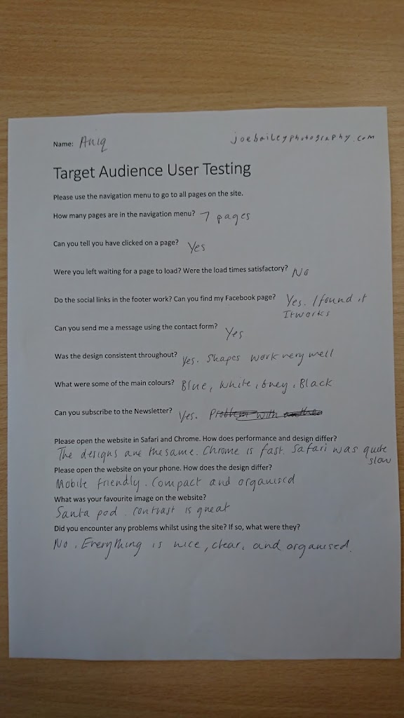
Target Audience User Testing
Please use the navigation menu to go to all pages on the site.
How many pages are in the navigation menu?
Can you tell you have clicked on a page?
Were you left waiting for a page to load? Were the load times satisfactory?
Do the social links in the footer work? Can you find my Facebook page?
Can you send me a message using the contact form?
Was the design consistent throughout?
What were some of the main colours?
Can you subscribe to the Newsletter?
Please open the website in Safari and Chrome. How do performance and design differ?
Please open the website on your phone. How does the design differ?
What was your favourite image on the website?
Did you encounter any problems whilst using the site? If so, what were they?
Successful notification of contact form enquiries:

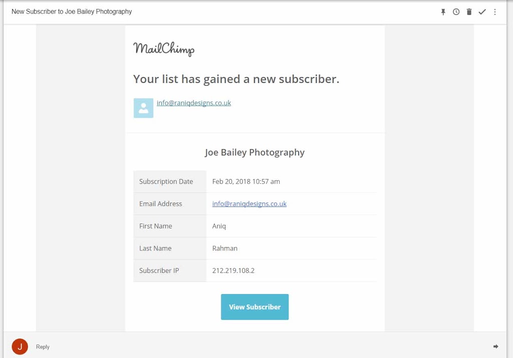
Successful notification of subscription to newsletter:
Target Audience User Testing Completed Forms:

Above: The Instagram widget was broken because school wifi blocked the domain where the widget was hosted. This is a school only issue, so I won’t bother to rectify it.
Text overlap issues were caused by having outdated browsers on school computers. They did not support CSS-Grid which is a relatively new specification. Most browsers will automatically update themselves and all modern browsers now support the feature, so I won’t bother to change the website for this issue.
The graph below shows support for CSS-Grid:


Above: School antivirus blocked this student from opening Safari for some reason, nothing to do with the website.

The full-size images used as the header of the page make it difficult to tell when you have changed page.
Improvements to be made:
- The website is reported to be very fast from all of my test audience.
- After receiving feedback from my Target Audience I have found that website performance suffers when using safari. I will have to test the website again on this browser to see if I can determine the problem.
- All users liked the design and thought it was professional and neat.
- Only one person identified the purple colour when clicking on a link. This was very faint, so will need adjusting so more users can see it.
- When searching for Joe Bailey Photography on Google, my website is the second result. I will try to improve my result by using an SEO Checker to improve my websites score and to provide insight into how to do so. One way would be to lengthen page descriptions, as they are quite short at the moment.
- There are a lot of different colours on the homepage which may cause some confusion as to what colours are in the main theme of the website. More thorough user testing and changes to where different colours are displayed on the website would help rectify this problem.
- A comment was given on how the use of shapes and slants on photos was very unique and worked well. This is something I will try to do more of on subsequent pages added to the site.
- One user encountered a small error using the newsletter sign-up form. Newsletters are handled through a third party (Mailchimp) which leaves little control of sign-up pages. In the future, I could migrate the newsletters to in-house so that I have complete control.
https://joebaileyphotography.com

Index – Desktop 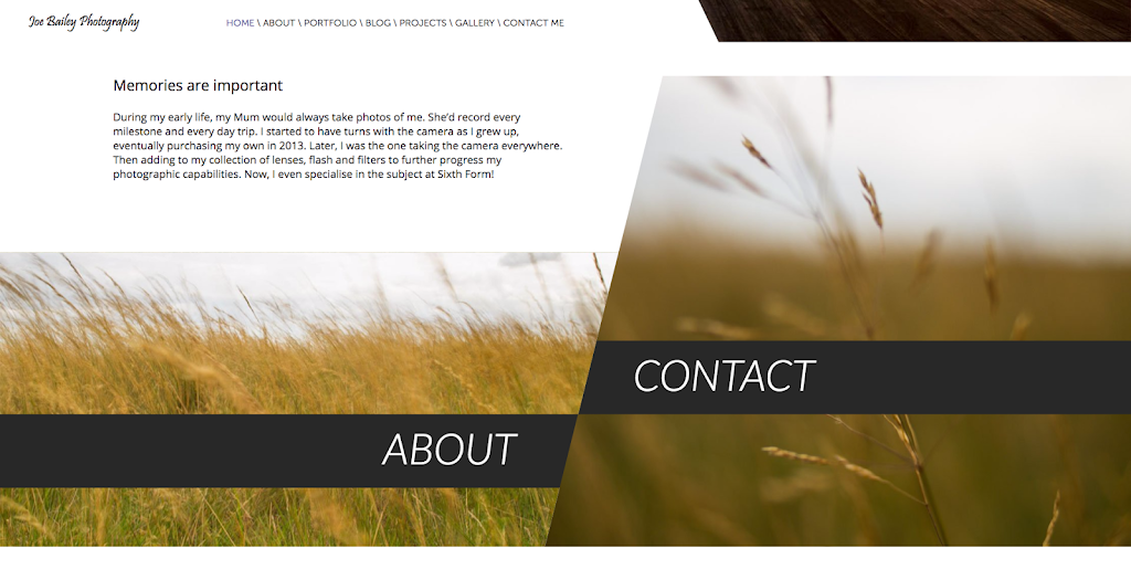

Contact Page – Desktop 
Footer – Desktop 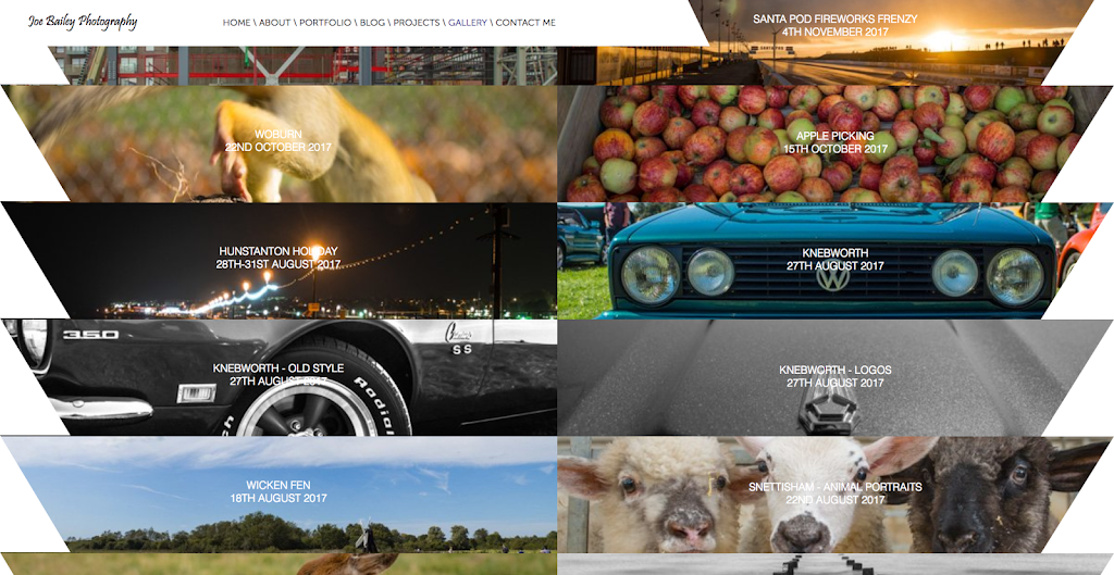
Gallery – Desktop 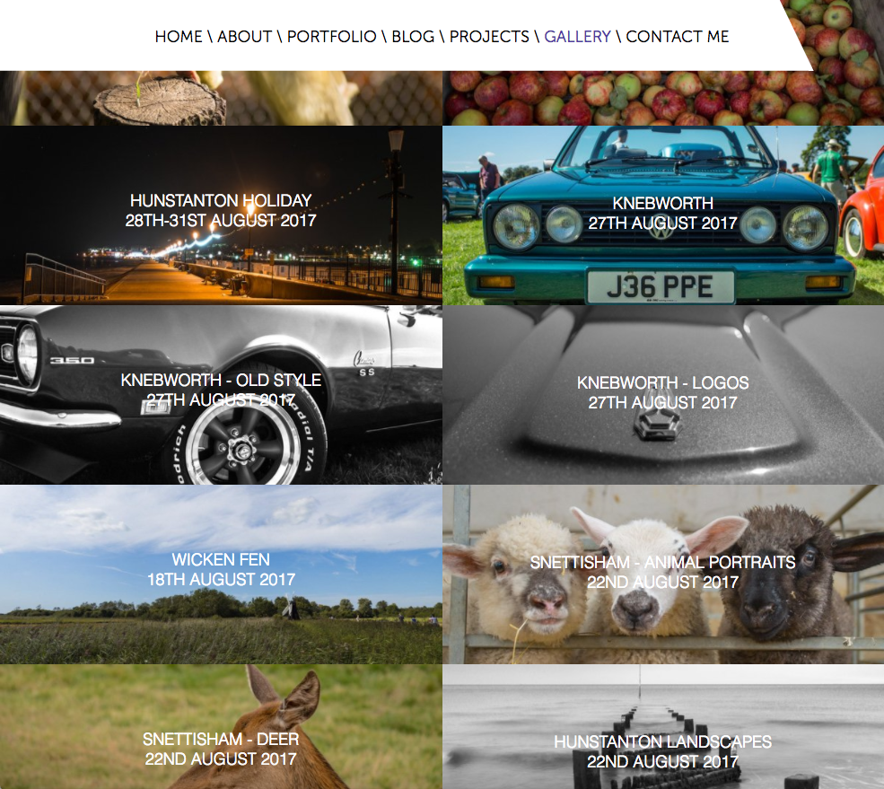
Gallery – Tablet 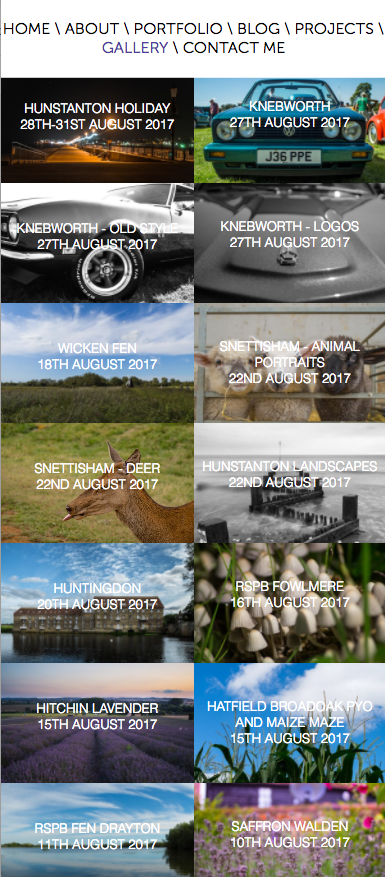
Gallery – Mobile
Example HTML with comments:
<!doctype html>
<html lang="en-GB">
<head>
<meta charset="utf-8">
<meta name="viewport" content="width=device-width, initial-scale=1.0">
<title>Joe Bailey Photography</title>
<meta name="description" content="Joe Bailey is a student photographer currently based near Cambridge, UK. As well as photography he enjoys web design and writing.">
<link href="CSS/index.css" media="all and (min-width: 1110px)" rel="stylesheet" type="text/css">
<link href="CSS/indexMedium.css" media="all and (min-width: 830px) and (max-width: 1110px)" rel="stylesheet" type="text/css">
<link href="CSS/indexSmall.css" media="all and (max-width: 829px)" rel="stylesheet" type="text/css">
<link rel="stylesheet" type="text/css" href="https://cdnjs.cloudflare.com/ajax/libs/font-awesome/4.7.0/css/font-awesome.min.css">
<link rel="apple-touch-icon" sizes="180x180" href="/apple-touch-icon.png">
<link rel="icon" type="image/png" sizes="32x32" href="/favicon-32x32.png">
<link rel="icon" type="image/png" sizes="16x16" href="/favicon-16x16.png">
<link rel="manifest" href="/manifest.json">
<link rel="mask-icon" href="/safari-pinned-tab.svg" color="#488fc0">
<meta name="theme-color" content="#488fc0">
<link rel="stylesheet" type="text/css" href="//cdnjs.cloudflare.com/ajax/libs/cookieconsent2/3.0.3/cookieconsent.min.css">
<script src="//cdnjs.cloudflare.com/ajax/libs/cookieconsent2/3.0.3/cookieconsent.min.js" defer></script>
<meta property="og:title" content="Joe Bailey Photography" />
<meta property="og:description" content="Joe Bailey is a student photographer currently based near Cambridge, UK. As well as photography he enjoys web design and writing." />
<meta property="og:image" content="/android-chrome-512x512.jpg" />
<script>
window.addEventListener("load", function(){
window.cookieconsent.initialise({
  "palette": {
    "popup": {
      "background": "#488fc0",
      "text": "#c8c8c8"
    },
    "button": {
      "background": "#174172",
      "text": "#7d7d7d"
    }
  },
  "theme": "edgeless",
  "content": {
    "href": "https://joebaileyphotography.com/cookie-policy.html"
  }
})});
</script>
</head>
<body>
<!--Header Image and Text-->
<header>
    <img src="Images/Index/Index%20Header.jpg" class="Headerimage" alt="Joe Bailey Photography" width="100%" height="100%"/>
    <div class="title">Joe Bailey Photography</div>
    <div class="subtitle">Capturing memories, not images</div>
</header>
<!--Navigation Menu-->
<nav>
<svg width="84%" height="100.5" viewbox="1200 0 1 100">
    <polygon fill="#FFFFFF" points="1612.5,78 0,78 0,0 1575,0 ">
        <div class="navtitle">Joe Bailey Photography</div>
        <div class="navlinks">
            <a class="active" href="Index.html">Home</a>

            <a href="About.html">About</a>

            <a href="Portfolio.html">Portfolio</a>

            <a href="Blog.html">Blog</a>

            <a href="Projects.html">Projects</a>

            <a href="Gallery.html">Gallery</a>

            <a href="Contact%20Me.html">Contact Me</a>
        </div>
    </polygon>
</svg>
</nav>
<!--Important links with images-->
<div class="memoriestitle"><p>Memories are important</p></div>
<div class="memories"><p>During my early life, my Mum would always take photos of me. She’d record every milestone and every day trip. I started to have turns with the camera as I grew up, eventually purchasing my own in 2013. Later, I was the one taking the camera everywhere. Then adding to my collection of lenses, flash and filters to further progress my photographic capabilities. Now, I even specialise in the subject at Sixth Form!</p></div>
<div class="about">
    <svg class="aboutsvg" viewBox="0 0 1920 800" preserveAspectRatio="xMinYMin meet" width="100%" height="800">
    <defs>
        <pattern id="pattern1" height="100%" width="100%" patternContentUnits="objectBoundingBox">
            <image height="1" width="1" preserveAspectRatio="none" xlink:href="Images/Index/About1.jpg" />
        </pattern>
    </defs>
        <polygon fill="url(#pattern1)" points="925,800 0,800 0,300 1050,300 ">
        </polygon>
        <a xlink:href="about.html">
            <g class="aboutlink">
                <polygon id="aboutlink1" fill="rgba(40,40,40,1)" points="1026,700 0,700 0,575 1050,575 "></polygon>
                <text id="text" x="650" y="660" font-family="Lato" fill="white">ABOUT</text>
            </g>
        </a>
    <defs>
        <pattern id="pattern2" height="100%" width="100%" patternContentUnits="objectBoundingBox">
            <image height="1" width="1" preserveAspectRatio="none" xlink:href="Images/Index/About2.jpg" />
        </pattern>
    </defs>
        <polygon fill="url(#pattern2)" points="1920,800 925,800 1125,0 1920,0 ">
        </polygon>
        <a xlink:href="Contact%20Me.html">
            <g class="contactlink">
                <polygon id="contactlink1" fill="rgba(40,40,40,1)" points="1920,575 982,575 1013,450 1920,450 "></polygon>
                <text id="text2" x="1075" y="535" font-family="Lato" fill="white">CONTACT</text>
            </g>
        </a>
    </svg>
</div>
<!--Important links with images for mobile devices-->
<div class="phoneabout">
    <a href="About.html"><div class="phonelinks">ABOUT</div></a>
    <img src="Images/Index/About1.jpg" class="aboutimg" alt="About" width="100%" height="150px"/>
    <a href="Contact%20Me.html"><div class="phonelinks">CONTACT</div></a>
    <img src="Images/Index/About2.jpg" class="aboutimg" alt="Contact" width="100%" height="150px"/>
</div>
<!--Instagram widget showing my latest posts-->
<div class="insta">
    <p>Follow what I'm up to on Instagram <a href="https://www.instagram.com/joebaileyphotography/">@joebaileyphotography</a></p>
<script src="https://snapwidget.com/js/snapwidget.js"></script>
<iframe src="https://snapwidget.com/embed/481198" class="snapwidget-widget" allowTransparency="true" frameborder="0" scrolling="no" style="border:none; overflow:hidden; width:75%; "></iframe>
</div>
<!--My favourite photography quote-->
<div class="quote">
    <img src="Images/Index/Quote.png" height="auto" width="100%" alt="The whole point of taking photos is so that you don't have to explain things in words. - Elliott Erwitt"/>
    <div class="quoteoverlay">
        <div class="quotes">" The whole point of taking photos is so that you don't have to explain things in words "</div>
        <div class="elliott">- Elliott Erwitt</div>
    </div>
</div>
<!--Link to my blog-->
<div class="blog">
    <p>If there’s one thing that I’ve learnt from my venutre into photography over the past 4 years, it’s that you are never done learning. You’ve mastered this skill? OK, get ready for the next. Photography is an ever expanding field of interest for people across the world. It’s a truly universal language, creating  friendships no-one thought possible. Photography continues to grasp my interest as I further my career into the deep realms of the subject. </p>
</div>
<div class="blogposts">
    <a href="Blog.html">
        <img width="16%" src="Images/Index/blog.png" alt="Recent Blog Posts"/>
        <p>Blog Favourites ></p>
    </a>
</div>
<!--Footer-->
<footer>
    <!--Link to subscribe to Newsletter-->
    <div class="newsletter">
        Stay Connected. <a href="http://eepurl.com/bBnwk1">Subscribe to the Newsletter</a>
    </div>
    <!--Legal content and social links-->
    <div class="legal">
        <div class="socials-footer">
            <a href="https://www.facebook.com/joebaileyphoto/" class="fa fa-facebook"></a>
            <a href="https://www.instagram.com/joebaileyphotography/" class="fa fa-instagram"></a>
            <a href="https://500px.com/joe_bailey_photography" class="fa fa-500px"></a>
            <a href="https://www.flickr.com/photos/joebaileyphoto" class="fa fa-flickr"></a>
            <a href="https://www.pinterest.co.uk/billybidley26/" class="fa fa-pinterest"></a>
            <a href="https://www.youtube.com/channel/UCb85Oly9IKhBWOV5cjkpemw" class="fa fa-youtube-play"></a>
        </div>
        <p>© 2018 Joe Bailey Photography. All rights reserved. | <a href="cookie-policy.html"> Cookie Policy </a> | <a href="privacy-policy.html"> Privacy Policy </a></p>
    </div>
</footer>
</body>
</html>
Merit:
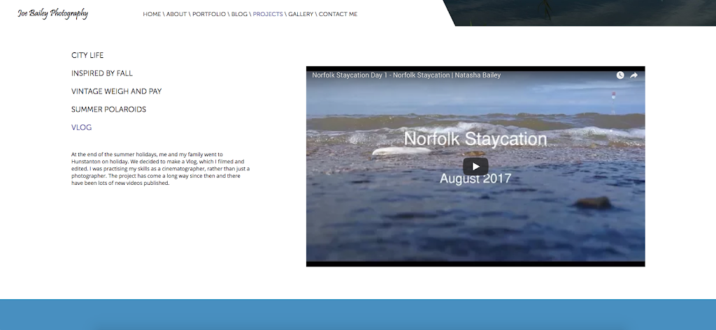
There is rich media on the projects page of my website which features a video.
Distinction:
Optimisation:
I have minified the javascript files on my website to decrease the download size of my pages. This will make them load faster.
I have optimised my images by making them as small as possible without losing image quality. This again decreases download size and speeds up the website.
Images used for the portfolio and gallery are hosted on Flickr’s website which will be faster than my own as they are a large company with more robust servers.
I have made sure that there is no redundant code in my website.
I have enabled gzip compression on my server which makes text transfers smaller, resulting in a faster website.
Comments have been removed on the production version of the site to increase security and minimize loading times.
Site Management Tools:
I have opted against using a Content Management System (CMS) as I wanted to learn HTML, CSS, and JavaScript. By coding the website it is much more customisable and I can create anything I want.
I have used some tools such as plugins to speed up web development.
I have used Featherlight which is a small and lightweight Lightbox widget. I have used this on my gallery page.
I have used a font plugin to enable me to add the social icons in the footer and contact page.
I have used a plugin to link to my Flickr album on the portfolio page.
I have used a widget on my homepage to display my most recent Instagram posts.
Search Engine Optimization:
I have used Google’s Search Console to add my sitemap and monitor my search performance. I have used the following website checker: https://seositecheckup.com/ to improve my score on it resulting in increased performance in Search Engines. I have linked my website to social media, resulting in a larger online presence, making y website come higher up in search results. I have a mobile-optimized version of the site, which Google recommends, and I use HTTPS. I have included appropriate favicons and titles and descriptions for all of my pages.
Purpose:
The primary purpose of my website is to showcase my photographic work to potential employers and universities.
The secondary purpose of my website is to attract customers to book me for photo shoots.
Target Audience:
The primary target audience are web development firms that I am applying to as I want to impress them by showcasing my web design and photographic work. Universities such as Southampton Solent and Gloucestershire where I am applying to do web design can look at my website to view my skills. Having a website is a quick and easy way to show off my work. Because my website is targeted towards design professionals I will use very modern design techniques to make it look aesthetically pleasing.
The secondary target audience of my website is 15-25-year-olds who are interested in photography and potentially would like a photoshoot.
A large, full-screen image is used when users land on the page as the target audience want to see the best examples of my work.
Text is kept to relatively short paragraphs because my target audience of employers and universities want to be shown my work rather than read about it. 15-25-year-olds have short attention spans, so similarly want to be shown my work.
The homepage features an Instagram widget as my secondary target audience will likely be on Instagram and would like to follow me for examples of my work.
Social media links are at the bottom of each page for potential customers to keep up to date with what I’m doing.
The website spans the entire width of the page compared to some websites which are contained within a column on the page. This is because most of my clients and employers will have widescreen computer monitors and will be able to see the full width of the website.
The homepage features About and Contact links because these are the most important pages that my target audience would want to visit. They want to know who I am, and then how to contact me.
Content:
Index containing links to more important pages; about and contact. There will also be some information on me.
About page showing a timeline of my life and me.
Portfolio showing my best images
Blog showing posts of my latest shoots
Projects showcasing things I’ve worked on
Gallery of images
Contact page with a form, email, and phone number
The navigation menu will stick to the top of the page in order for users to navigate around more quickly
Most of my target audience will be on social media, therefore links to me on social media will be at the bottom of each page
The website will be edge to edge featuring large, high-resolution images. This will appeal to my target audience as they want to see as many examples of my work as possible
The about page features a story about me which is humorous. This will help appeal to my target audience and they should like me more
The website will feature very subtle colours, making the viewing experience pleasurable. The cool blues will not strain my target audience’s eyes
Text is split up into small paragraphs. My target audience doesn’t want to be reading massive paragraphs of information, but snippets of important information.
Fonts:
Pristina – Joe Bailey Photography
Museo Sans – Title
Open Sans – Paragraph
Helvetica – Important Text
Colours:
Light Blue – Newsletter Footer: #488fc0
Dark Blue – Legal Footer: #174172
White – Background: #FFFFFF
Black – Text: #000000
Selection of grey – Text: #646464, #c8c8c8, #7d7d7d
Logo:

I have used this logo as it has a plane on it, something I primarily photograph. It also features a blue background, one of my main colours. The plane also has my name on.
Site Map:
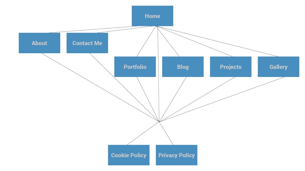
The above diagram shows how a user would navigate through the website.
They would land on the homepage. The About and Contact Pages are the next most important. This means visitors are most likely to visit these pages next, that’s why large links to these pages have been included on the homepage. Portfolio, Blog, Projects, and Gallery are all important pages and have been included on a sticky top-nav. The Cookie Policy and Privacy Policy are least important and are displayed in small font at the very bottom of the page in the footer.
Information flow and visitor needs:
My primary target audience will land on the index page of the site. They will want to be impressed by the design of my site and the quality of my images which is why I have used a large fullscreen image for the homepage. They will then scroll down and discover the shape design with slanted angles. This is unusual and is designed to impress my target audience. As users continue scrolling down they get a feel for the site and what I am about with paragraphs about me, my favourite quote by a photographer and a link to my blog. this design is consistent throughout the site to impress my target audience. Large, high-quality images are displayed throughout the site indicating I’m a photographer. I have only used my best images on pages throughout my site to give off a professional outlook. A typical user will land on the homepage and then visit the about page, as they want to know what type of person they are working with. Then, rather than visiting the gallery, they will visit my portfolio for a quick overview of my work. Following that they will choose whether they want to contact me or not.
My secondary target audience will want to find out what types of photos I take and the quality of these photos, then find out some information about me on the about page, then contact me.
They will land on the Index page, which has very large links to About and Contact in order for them to navigate the website more easily. The navigation bar also has links to the rest of the pages on the website. A typical user might visit the index page, then the about page to find out information about me, and the gallery, portfolio, and projects pages to see my work. After they have found out the information they want they will want to contact me, which is the last thing they will do on my site which is why it is the last thing on the navigation menu.
Production Plan:
|
Start Date
|
End Date
|
What I’m doing
|
|
12th January
|
20th January
|
Templating Website
|
|
21st January
|
23rd January
|
Index
|
|
24th January
|
24th January
|
Contact
|
|
25th January
|
26th January
|
Projects
|
|
27th January
|
27th January
|
Blog
|
|
28th January
|
29th January
|
Portfolio
|
|
30th January
|
1st February
|
About
|
|
2nd February
|
5th February
|
Gallery
|
|
6th February
|
8th February
|
Making Website Responsive
|
|
9th February
|
9th February
|
Adding favicons
|
|
10th February
|
17th February
|
Thorough testing of website on multiple platforms
|
|
18th February
|
22nd February
|
Using multiple website checkers such as SEO Tools and Page Speed Insights to improve the website in search results and improve loading times
|
|
25th February
|
25th February
|
Launch of website using social media and newsletter
|
Budget:
The website will be hosted by 1and1. Domain name hire costs £9.99 per year. I have two domain names: joebaileyphotography.co.ukand joebaileyphotography.com
Hosting costs £5.99 per month including an SSL certificate.
All web design and development work, as well as photography, will be done by me, which is therefore free.
In the future, I may expand my website by implementing a store. I will use open source software meaning it will be free. This will also be a possible source of revenue.
Possible sources of revenue:
By having a website, I have increased my exposure as a photographer meaning there is a chance of more work for me to do, a possible source of revenue. According to Google Analytics, my website gets on average 200 unique visitors a month. Around 5 of these people will inquire about my photographic services per month. Only 1 or 2 will follow through with their enquiry. One photoshoot would cost £100. Two per month equals £200 revenue and £194 profit.
Legal and Ethical Issues:
No photos of people apart from myself and very occasionally members of my family will be featured on the website so as to protect their identities.
A cookie notice will be displayed for new visitors as outlined by EU law.
I own my images, and will only use my images on the website. A copyright notice will be displayed in the footer.
I will use a tool to verify information entered in the contact form to prevent spam.
I will use protected directories in my site to prevent unauthorised access to specific content.
Users information is secure as the website uses HTTPS. Information transmitted is encrypted by Secure Sockets Layer.
