a) purpose
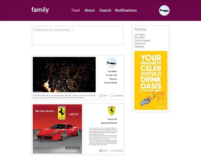
A family-based social networking platform similar to Facebook but without memes and pages. Members will be able to post status updates, along with photos and videos to share with their family and friends. There won’t be alike or share system, but people will be able to comment on posts, with a very in-depth sensor system, allowing users much younger than 13 to join the site, unlike Facebook. Images will be stored at high quality as a way of backing up photos, there will be an option to download everything ever uploaded to the site if users lose their photos.
b) format/style
There will be card based posts on a user’s feed that people can swipe to get rid of, much like Inbox by Google. They will swipe them after they have seen them to remove them from the newsfeed. Users will have profile pages displaying all of their posts, and a little section about them to help other users identify who they are.
c) target user/membership
Target users are 20-40-year-old parents of both genders who want to share their photos with extended family members and friends. It will be free to join the site, with options to pay for upgraded storage to store more photos.
d) mock ups

a) purpose
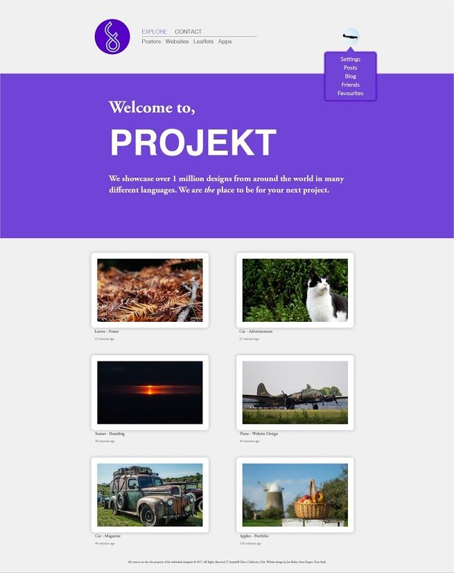
A website for designers to post their ideas and designs and get feedback from other likeminded people. There will also be employers on the website which can find designers suited to their workplace which they can get in contact with to hire.
b) format/style
The website will be very nicely designed using a minimal style as it is aimed at designers so will have to look nice. There will be no adverts on the site. The homepage will be an about section, explaining how the site works. There will then be a page featuring the latest designs from people all over the world. There won’t be a search function, but people will be able to sort the feed into categories such as posters and websites.
c) target user/membership
Target users are designers aged 20-30 with a high spending power as you have to subscribe to this website $4.99 a month. This ensures only the best designers are putting their best work on the site. The website will be global, with a headquarters in America.
d) mock ups
a) purpose
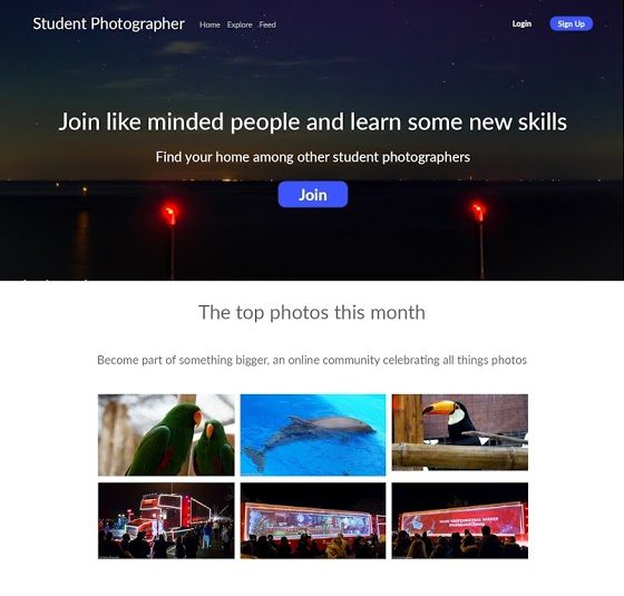
For photography students to share ideas, and work in a safe, secure environment. They can follow their favourite photographers. Write blogs and use this as work experience on their CVs. They can find people to work with to practice their skills and to learn from.
b) format/style
There will be a navigation bar at the top of the page. Popular photographers will be featured on the home page, encouraging people to like and follow them. Users will have a profile page with a showcase of 25 photos, and all of their work, including recent blog posts. There will be an explore page where users can search for photographers or content. Adverts will be displayed among search results and featured photographers. The adverts will be non-obtrusive.
c) target user/membership
Target users are photography students aged between 16 and 25. They will be interested in the world around them, and in doing photography later in life. There will be a paid option which removes adverts and offers users advanced statistics about their blog and profile as well as a portfolio website.
d) mock ups


