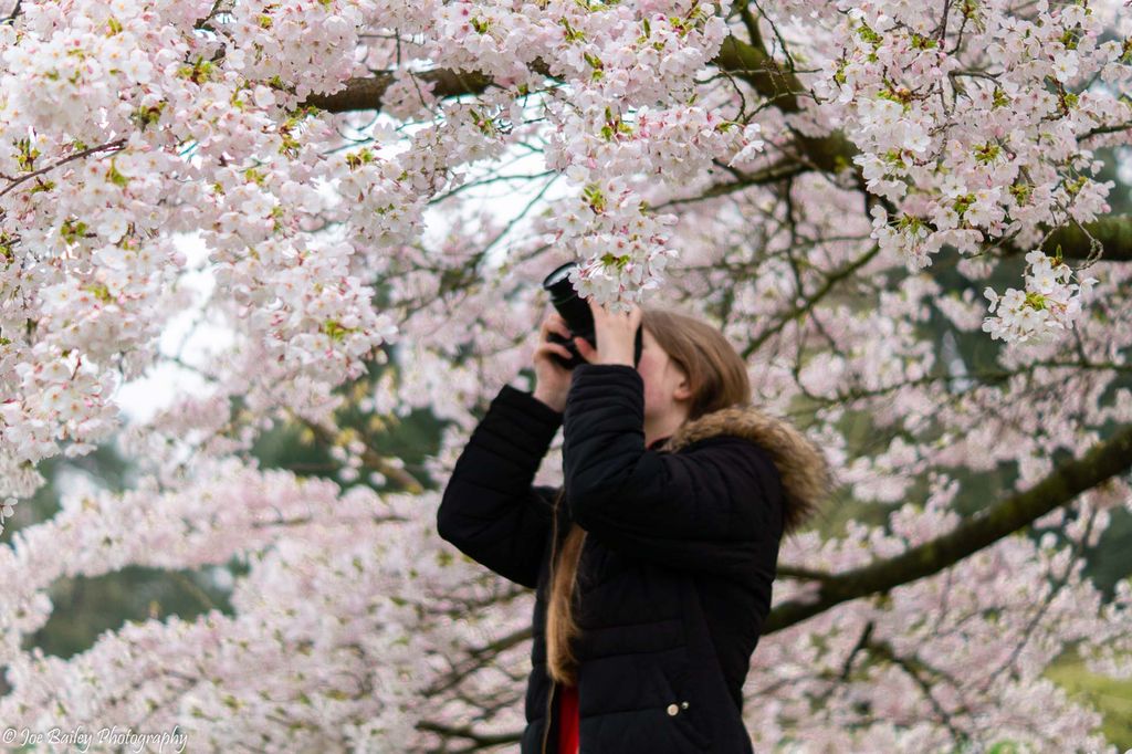
I created a website for my girlfriend as she does photography too. I’m really impressed with the site, even though it is made with WordPress. Hopefully, her future employers and universities will like it too. You can view the site here.
I need to make a No Thumbnails Gallery WordPress plugin as at the moment I am using CSS to hide all the images but the first one to create the galleries you see. This really slows down the website.

–Updated 5th October 2019–
I had wanted to develop a custom theme for Chelsea’s website for a long while. The theme I was using was bloated, slowed the site down, and didn’t fit her style of photography.
I designed a template in Figma, making a style guide first, noting down the fonts, Satisfy, Montserrat, and Roboto, and the colours, Pink, and some shades fo grey. Doing a mockup of the site proved really beneficial because I made many different versions and could show them to my colleagues easily, which would have been a nightmare if I had just started developing. I even went with a mobile-first approach.
I knew that the portfolio had to be the most prominent feature on the website as that was the biggest shortfall of the previous theme. I used some JavaScript to only change the images and text on the homepage so that portfolios are all hosted on the same page. They are also shareable as they use query strings. On mobile, only 6 portfolio images can be seen but the lightbox allows you to view all 20 images.
I made a few changes to the design when I was making the website such as making the background a light shade of pink. This helped differentiate the elements on the page.
I also designed a new logo which is a lot more intricate than the initial rudimentary one.