Purpose:
The primary purpose of my website is to showcase my photographic work to potential employers and universities.
The secondary purpose of my website is to attract customers to book me for photo shoots.
Target Audience:
The primary target audience are web development firms that I am applying to as I want to impress them by showcasing my web design and photographic work. Universities such as Southampton Solent and Gloucestershire where I am applying to do web design can look at my website to view my skills. Having a website is a quick and easy way to show off my work. Because my website is targeted towards design professionals I will use very modern design techniques to make it look aesthetically pleasing.
The secondary target audience of my website is 15-25-year-olds who are interested in photography and potentially would like a photoshoot.
A large, full-screen image is used when users land on the page as the target audience want to see the best examples of my work.
Text is kept to relatively short paragraphs because my target audience of employers and universities want to be shown my work rather than read about it. 15-25-year-olds have short attention spans, so similarly want to be shown my work.
The homepage features an Instagram widget as my secondary target audience will likely be on Instagram and would like to follow me for examples of my work.
Social media links are at the bottom of each page for potential customers to keep up to date with what I’m doing.
The website spans the entire width of the page compared to some websites which are contained within a column on the page. This is because most of my clients and employers will have widescreen computer monitors and will be able to see the full width of the website.
The homepage features About and Contact links because these are the most important pages that my target audience would want to visit. They want to know who I am, and then how to contact me.
Content:
Index containing links to more important pages; about and contact. There will also be some information on me.
About page showing a timeline of my life and me.
Portfolio showing my best images
Blog showing posts of my latest shoots
Projects showcasing things I’ve worked on
Gallery of images
Contact page with a form, email, and phone number
The navigation menu will stick to the top of the page in order for users to navigate around more quickly
Most of my target audience will be on social media, therefore links to me on social media will be at the bottom of each page
The website will be edge to edge featuring large, high-resolution images. This will appeal to my target audience as they want to see as many examples of my work as possible
The about page features a story about me which is humorous. This will help appeal to my target audience and they should like me more
The website will feature very subtle colours, making the viewing experience pleasurable. The cool blues will not strain my target audience’s eyes
Text is split up into small paragraphs. My target audience doesn’t want to be reading massive paragraphs of information, but snippets of important information.
Fonts:
Pristina – Joe Bailey Photography
Museo Sans – Title
Open Sans – Paragraph
Helvetica – Important Text
Colours:
Light Blue – Newsletter Footer: #488fc0
Dark Blue – Legal Footer: #174172
White – Background: #FFFFFF
Black – Text: #000000
Selection of grey – Text: #646464, #c8c8c8, #7d7d7d
Logo:

I have used this logo as it has a plane on it, something I primarily photograph. It also features a blue background, one of my main colours. The plane also has my name on.
Site Map:

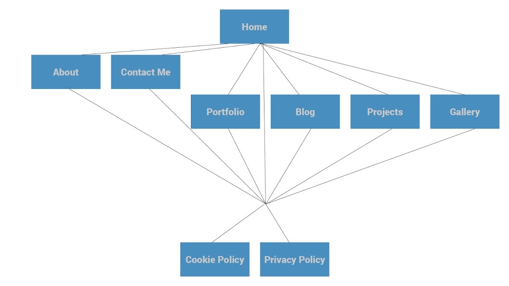
The above diagram shows how a user would navigate through the website.
They would land on the homepage. The About and Contact Pages are the next most important. This means visitors are most likely to visit these pages next, that’s why large links to these pages have been included on the homepage. Portfolio, Blog, Projects, and Gallery are all important pages and have been included on a sticky top-nav. The Cookie Policy and Privacy Policy are least important and are displayed in small font at the very bottom of the page in the footer.
Information flow and visitor needs:
My primary target audience will land on the index page of the site. They will want to be impressed by the design of my site and the quality of my images which is why I have used a large fullscreen image for the homepage. They will then scroll down and discover the shape design with slanted angles. This is unusual and is designed to impress my target audience. As users continue scrolling down they get a feel for the site and what I am about with paragraphs about me, my favourite quote by a photographer and a link to my blog. this design is consistent throughout the site to impress my target audience. Large, high-quality images are displayed throughout the site indicating I’m a photographer. I have only used my best images on pages throughout my site to give off a professional outlook. A typical user will land on the homepage and then visit the about page, as they want to know what type of person they are working with. Then, rather than visiting the gallery, they will visit my portfolio for a quick overview of my work. Following that they will choose whether they want to contact me or not.
My secondary target audience will want to find out what types of photos I take and the quality of these photos, then find out some information about me on the about page, then contact me.
They will land on the Index page, which has very large links to About and Contact in order for them to navigate the website more easily. The navigation bar also has links to the rest of the pages on the website. A typical user might visit the index page, then the about page to find out information about me, and the gallery, portfolio, and projects pages to see my work. After they have found out the information they want they will want to contact me, which is the last thing they will do on my site which is why it is the last thing on the navigation menu.
Production Plan:
|
Start Date
|
End Date
|
What I’m doing
|
|
12th January
|
20th January
|
Templating Website
|
|
21st January
|
23rd January
|
Index
|
|
24th January
|
24th January
|
Contact
|
|
25th January
|
26th January
|
Projects
|
|
27th January
|
27th January
|
Blog
|
|
28th January
|
29th January
|
Portfolio
|
|
30th January
|
1st February
|
About
|
|
2nd February
|
5th February
|
Gallery
|
|
6th February
|
8th February
|
Making Website Responsive
|
|
9th February
|
9th February
|
Adding favicons
|
|
10th February
|
17th February
|
Thorough testing of website on multiple platforms
|
|
18th February
|
22nd February
|
Using multiple website checkers such as SEO Tools and Page Speed Insights to improve the website in search results and improve loading times
|
|
25th February
|
25th February
|
Launch of website using social media and newsletter
|
Budget:
The website will be hosted by 1and1. Domain name hire costs £9.99 per year. I have two domain names: joebaileyphotography.co.ukand joebaileyphotography.com
Hosting costs £5.99 per month including an SSL certificate.
All web design and development work, as well as photography, will be done by me, which is therefore free.
In the future, I may expand my website by implementing a store. I will use open source software meaning it will be free. This will also be a possible source of revenue.
Possible sources of revenue:
By having a website, I have increased my exposure as a photographer meaning there is a chance of more work for me to do, a possible source of revenue. According to Google Analytics, my website gets on average 200 unique visitors a month. Around 5 of these people will inquire about my photographic services per month. Only 1 or 2 will follow through with their enquiry. One photoshoot would cost £100. Two per month equals £200 revenue and £194 profit.
Legal and Ethical Issues:
No photos of people apart from myself and very occasionally members of my family will be featured on the website so as to protect their identities.
A cookie notice will be displayed for new visitors as outlined by EU law.
I own my images, and will only use my images on the website. A copyright notice will be displayed in the footer.
I will use a tool to verify information entered in the contact form to prevent spam.
I will use protected directories in my site to prevent unauthorised access to specific content.
Users information is secure as the website uses HTTPS. Information transmitted is encrypted by Secure Sockets Layer.